Magic CSS property: box-decoration-break

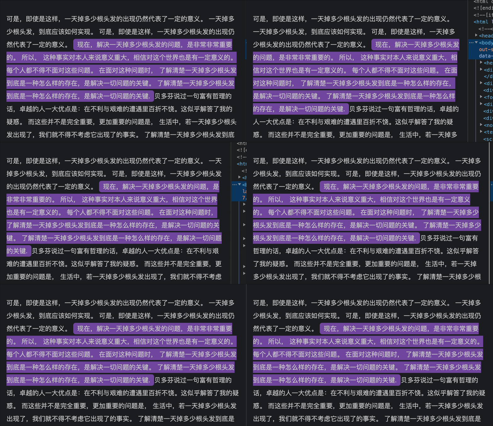
Before we start, let's take a look at a demo. In this demo, the highlighted part is given rounded corners and a beautiful pink background:

How is this effect achieved? Is it simply a matter of using a <span> tag, plus a couple of lines of background and border-radius CSS? For example, the following code?
HTML:
<p>How to ... <span class="highlight">Now, ... key.</span> ...</p>CSS:
.highlight { background: #7b50a8; border-radius: 6px; padding: 3px 10px; }However, when we write it like this, the actual effect is (note the background at the line break, which lacks rounded corners and cuts off directly)

So, do we need to use JS to achieve it? That doesn't seem quite practical.
In fact, this effect can be solved with just one line of CSS box-decoration-break: clone;
Understanding box-decoration-break
box-decoration-break is a very useful property in CSS3, allowing the background, border, and padding of a box model to break at the division point without affecting the style of other parts.
Before introducing Box-decoration-break, we need to understand the CSS box model. The CSS box model is a rectangular box composed of four parts: content area, padding area, border area, and margin area. The size and style of these four parts can be controlled by CSS properties. However, when a box model is cut or split into two or more parts, the size and style of these parts may be affected.
At this point, the box-decoration-break property comes into play. The box-decoration-break property defines how to handle the background, border, and padding of a split box model. The box-decoration-break property has three values:
- slice: The background, border, and padding of the split box model will be cut at the division point.
- clone: The background, border, and padding of the split box model will be cloned to each split part.
- initial: Use the default value.
By default, the value of the box-decoration-break property is slice, which is the effect we saw in the second case. If we set the value of the box-decoration-break property to clone, it means that the background, border, and padding of the split box model will be cloned to each split part.
So, to achieve the initial effect, we just need to add one line box-decoration-break: clone; (of course, in webkit-based browsers, you need to add -webkit-box-decoration-break: clone;) to solve the problem. That is:
.highlight { box-decoration-break: clone; -webkit-box-decoration-break: clone; background: #7b50a8; border-radius: 6px; padding: 3px 10px; }In summary, the box-decoration-break property is a very useful CSS property, helping us to handle the background, border, and padding of split box models. By setting different property values, we can control the style of the split parts, making them look more continuous and unified. In actual development, we can use the Box-decoration-break property as needed to improve the readability and aesthetics of the page.