Notes of CSS Variable Secrets - CSS Day 2022

I accidentally watched the video about CSS Variable introduced by Lea Verou on CSS Day 2022, and I have to feel that CSS has almost become something I don’t know. Let's talk about CSS variables with the cases in the video.
1 Introduction to CSS Variables
If you have previously used precompiled CSS extensions such as Less and Sass, you must be impressed by the variable system. For example, Sass uses $ to declare variables:
$base-color: #c6538c;
$border-dark: rgba($base-color, 0.88);
1.1 Definition of CSS Variables
You can also use -- to declare variables in native CSS, such as --color: pink. After completing the declaration, the corresponding variable can be called through var(). A simple example is as follows:
button {
  --color: green;
  border: 1px solid var(--color);
  color: var(--color);
  /* Other unimportant decoration styles */
}
In this example, we define the color variable to be green through --color and apply this value to the button's border and color through var(--color), the result is as follows :

When calling CSS variables via var() , we can specify an alternate value that CSS will call if the variable does not exist. For example, in the following case, we try to call the variable --color2, which is not declared, and specify that the alternate color is orange:
#button_fallback {
  border: 1px solid var(--color2, orange);
  color: var(--color2, orange);
}
The final result shows the alternative orange.

1.2 Modify CSS variables through JS
We can also set CSS variables through JS, that is the style.setProperty() method. For example, we randomly set a color every time the button is clicked:
<button onclick="this.style.setProperty('--color', `hsl(${Math.random() * 360} 90% 50%)`)">Click me</button>Then, the effect of his operation is this:

1.3 Variable Type and Animation of CSS Variables
CSS has variables. Why do we need to define variable types? Is this superfluous? We can illustrate this with an animated example.
In this example, we set a 5s color change animation for a button (id="button_example4") and change the color's hue value from 0 to 180 in the animation.
@keyframes color-hue {
  from { --color-hue: 0; }
  to { --color-hue: 180; }
}

#button_example4{
  --color: hsl(var(--color-hue) 60% 50%);
  animation: 5s color-hue linear infinite;
}
According to our expectation, this animation should fade from color A to color B in 5s, but the result is:

The color does not have a gradient, but the color jumps directly to another color every 5s. This is because we didn't specify the type of the color-hue variable. CSS doesn't know if color-hue should be a number or a color type value (like red, blue, etc.).
1.3.1 Defining the type of CSS variable via @property
If we want to declare the variable type, we can define it through @property. In the above example, we add the type declaration for --color-hue:
@property --color-hue {
syntax: "<number>";
initial-value: 0;
inherits: true;
}
Here it is declared that its type syntax is a value <number>, and the initial value initial-value is 0, let's take a look at the effect:

The perfect gradient process!
In addition to <number>, we can also use other types, such as specifying a value of type <color> in the following ways:
@property --color {
syntax: "<color>";
initial-value: black;
inherits: true;
}
In addition to defining the type of variable in CSS, we can also define it through the CSS.registerProperty() API from JS, for example:
window.CSS.registerProperty({
  name: '--color',
  syntax: '<color>',
  inherits: false,
  initialValue: black,
});
Complete example:
2 The magic of CSS variables
2.1 Using Invalid At Computed Value Time of CSS variables to make style switches
I've always found the following example to be amazing (the interactive demo is at the bottom of this section). We can control whether the button uses the highlight effect by calling the ON and OFF variables just like in JS - when we set glossy to OFF, the highlight effect disappears, and vice versa:
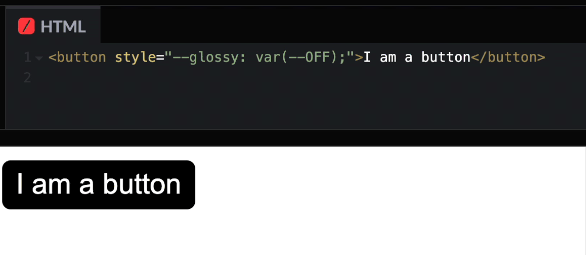
Is it interesting? This mainly uses a hack of CSS runtime checking, the full name of which is Invalid At Computed Value Time (IACVT). As the name suggests, when CSS finds a variable with an unusable value, it ignores the current content and sets the CSS for that bar to the unset state - the invalid state. Some of the following conditions trigger IACVT:
Incorrect value type
--foo: 42deg;
background: var(--foo);
Here we define the variable
foo, but since the background attribute cannot be an angle, the final result isbackground: unset;Uninitialized or empty (
) variablebackground: var(--foo);--foo: ; background: var(--foo);The above two cases will cause the background to be invalid, ie
background: unset;Reference to an unavailable value
--foo: var(--bar);
--bar: var(--foo);
Circular references, but --foo and --bar are both correctly assigned, so both result in
unset
Knowing the above, combined with the fallback mechanism of var() - when the first parameter of var is guaranteed-invalid value and we provide the second parameter, var will call the second fallback parameter. We can make CSS functions with ON and OFF:
First, we define
ONandOFFbutton { --ON: initial; --OFF: ; }Here we initialize
ONwithinitialand defineOFFas invalid CSS with a blank string.Use the fallback of
var()to configureborder,background, etc.button { border: var(--glossy, .05em solid black); background: var(--glossy, linear-gradient(hsl(0 0% 100% / .4), transparent)) var(--_color); box-shadow: var(--glossy, 0 .1em hsl(0 0% 100% / .4) inset); line-height: calc(1.5 var(--glossy, - .4)); }Since
initialis a guaranteed-invalid value, but the first parameter of var isguaranteed-invalid, var goes back to call the fallback value. So when we setglossytoON, the border becomesvar(initial, .05em solid black)and the natural application is.05em solid black, but when we setglossyWhen set toOFF, border:will not work since empty is a valid (empty) value. The same is true forline-height, whenglossyisON, line-height is1.5 - .4, and whenglossyisOFF, this style does not take effect
Experience Demo:
3. Defying CSS Variables
I can only describe the demo I see next (the Demo is at the bottom of this chapter) - the height of the bar chart, the text value, and the background color can be controlled through a variable p, and no line of JS is used in the whole process.
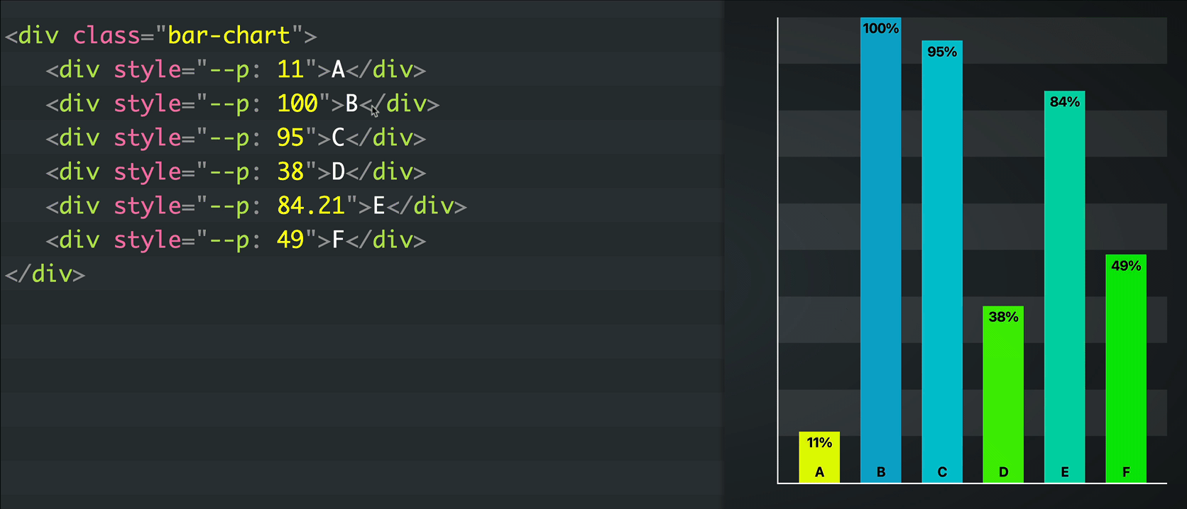
Here are a few things that I find interesting in this case:
- CSS variable to control the height of the bar
- CSS variables control text display (how to deal with the unit conforming to
%, how to do rounding) - CSS variable to control the background color of the bar
Let's take a look one by one:
3.1 CSS variable to control the height of the bar
This should be a bonus question, ignoring the basic style and layout. If we use a percentage to display the height of the histogram, just convert the corresponding value into a percentage, such as: 20->20%,18.4->18.4%.
How to achieve it? The first thing that pops out to my mind is whether it is possible to splice directly, such as hight: var(--p)%, and the answer is no. Fortunately, the CSS calculation function calc can provide the conversion of value -> value unit, we only need the value of 1 unit corresponding to *:
height: calc(var(--p) * 1%);Of course, if you need to convert to other units, you can also multiply directly, such as converting to px: height: calc(var(--p) * 1px);
By the way, currently, converting from number to unit is easy, but trying to convert from unit to number (like 100% -> 100) is not supported yet.
3.2 CSS variables control text display
Percentage of text is implemented through content of div::before, but content does not accept direct conversions like height calc(var(--p) * 1%) nor does it support Call the variable directly, like content: var(--p) "%";. So we thought that we could solve our problem in disguise through counter-reset, so we have:
.bar-chart > div::before {
counter-reset: p var(--p);
content: counter(p) "%";
}
But after careful observation, I didn't find that if p is a decimal, the result is actually 0%
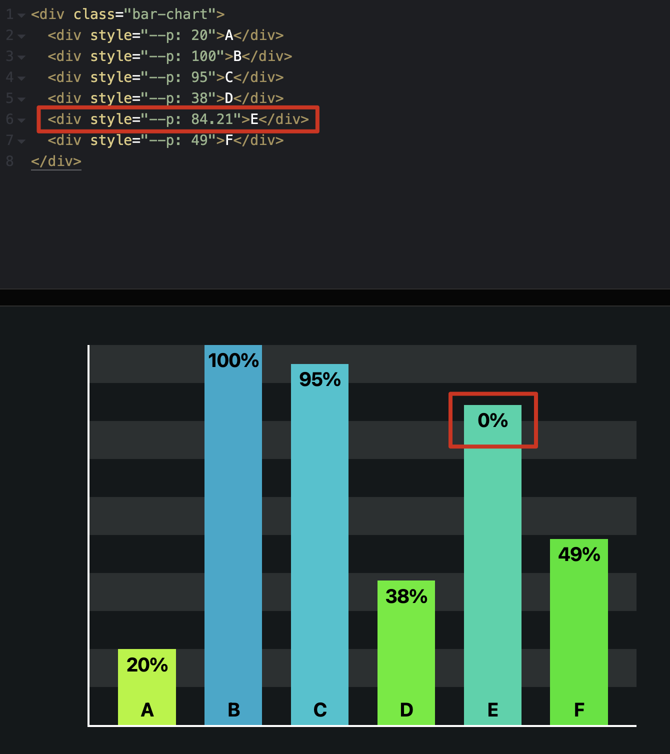
Why is this?
Is it possible that it is related to the variable type?
Then we try to declare p to be a number manually
@property --integer {
syntax: "<integer>";
initial-value: 0;
inherits: true;
}

.bar-chart > div::before {
--integer: calc(var(--p));
counter-reset: p var(--integer);
content: counter(p) "%";
}
Bingo! Problem solved!
If we take a closer look here, you will find that CSS uses a JS-like round method when converting decimals to integers. If we need something like ceil or floor, we can go to + 0.5 or - 0.5 in calc, such as --integer: calc(var(--p) + 0.5 ); Note here Leave spaces before and after the sign (+/-).
3.3 CSS variables to control the background color
The background color is a range of changes. For all changes within the range of values, we can use a formula to achieve Start + (End - Start) * percent, here we use the hsl color, and the plan is to control h in In the range of 50 - 100, l is controlled in the range of 50% - 40%. Applying the above formula, it is easy to get the following CSS
--h: calc(50 + (190 - 50) * var(--p) / 100); /* 50 to 190 */
--l: calc(50% + (40% - 50%) * var(--p) / 100); /* 50% to 40% */
background: hsl(var(--h) 100% var(--l));
Experience Demo: